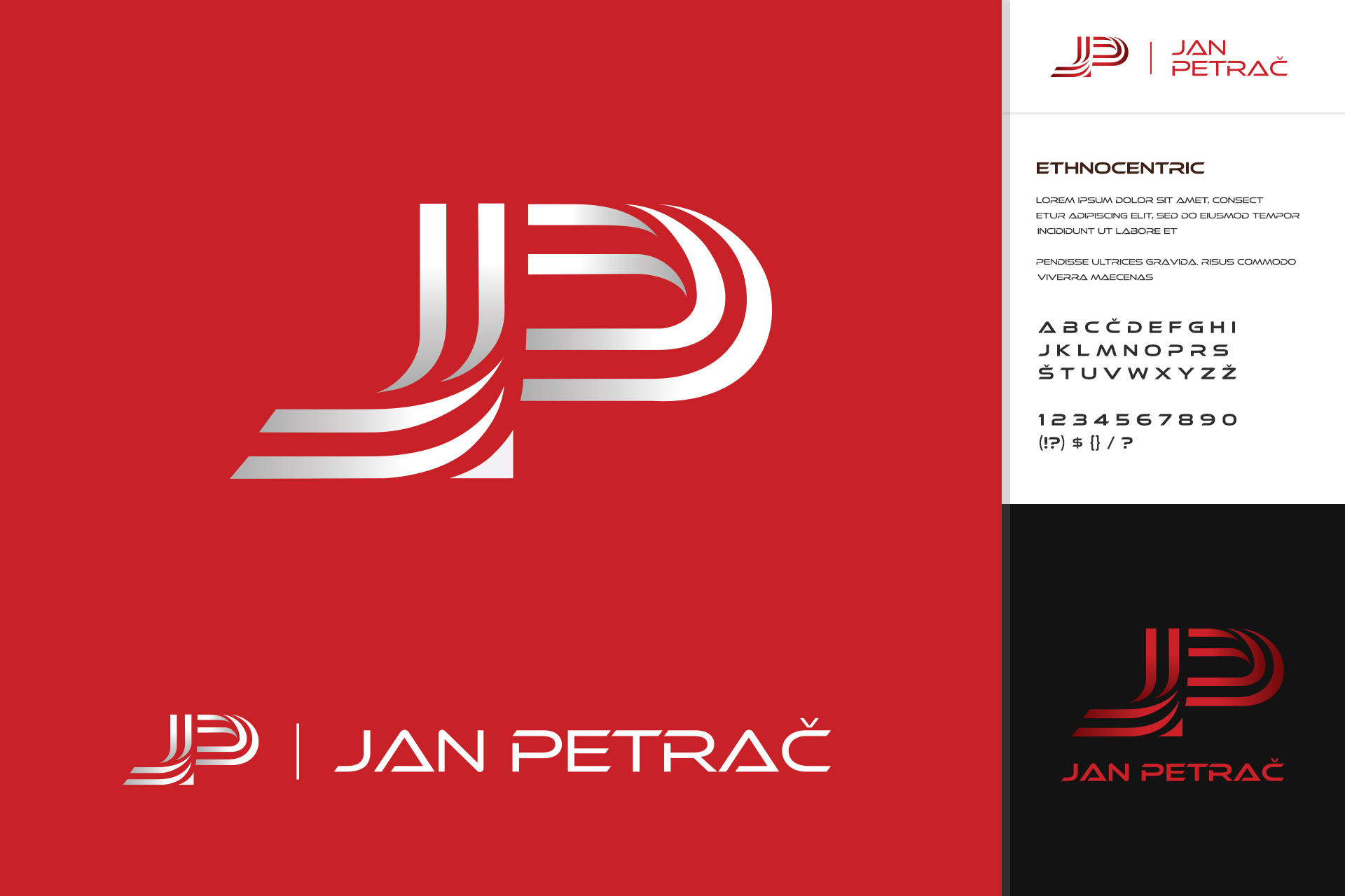
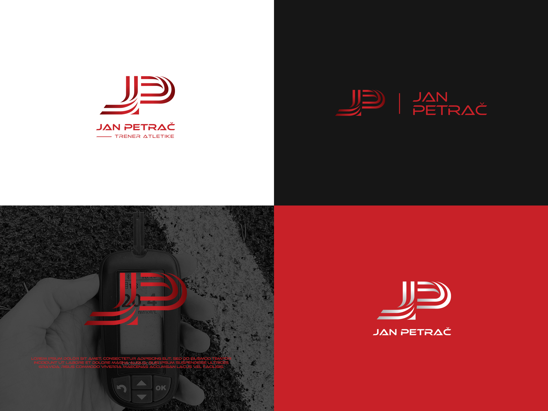
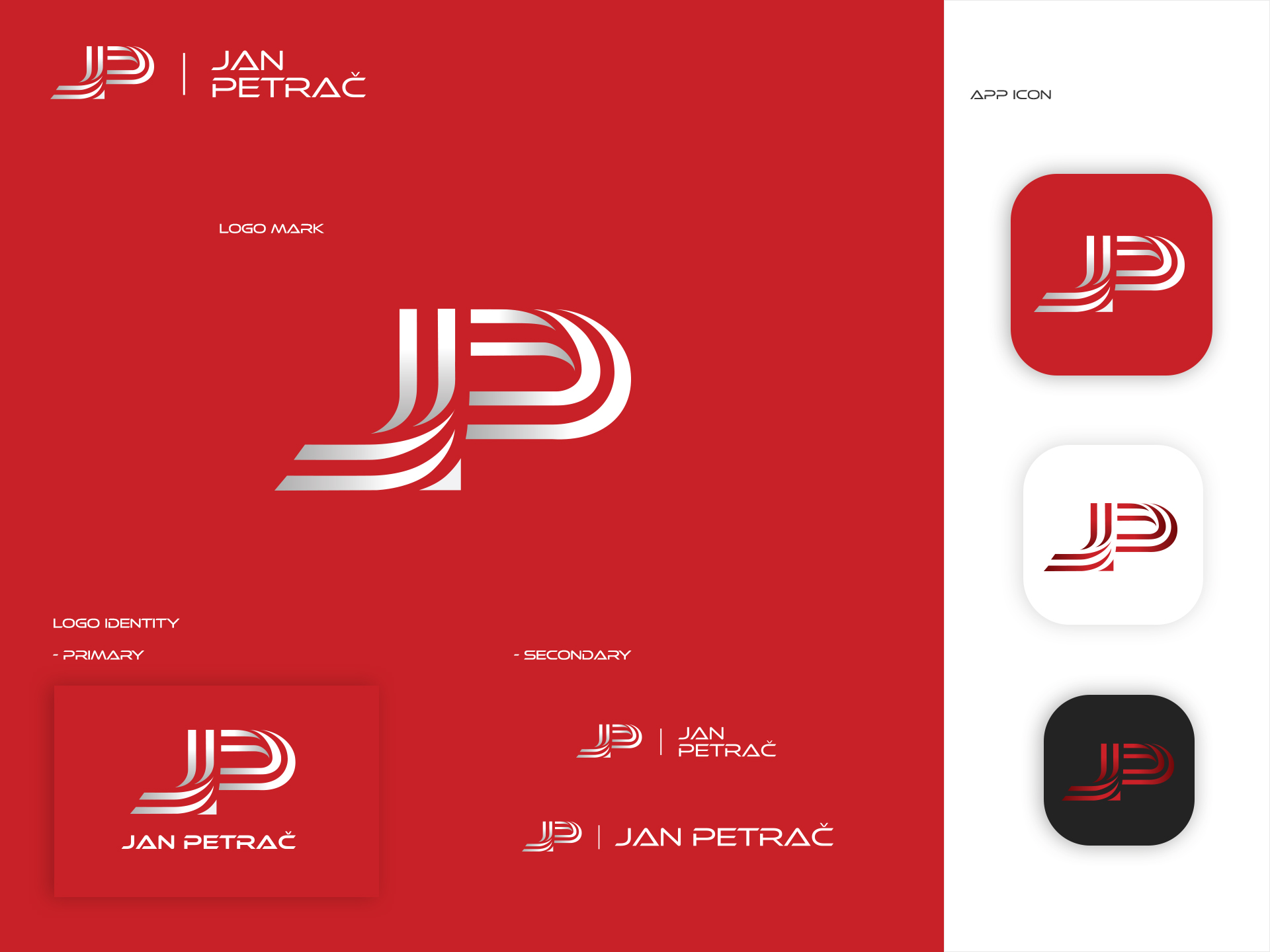
Logo design for the former Slovenian middle distance runner and now coach of a young group of runners, Jan Petrač. The client, who still holds many national records across various age groups, wanted something with an association with the context of track & field, stadium and the impression of speed. He wanted his initials to be incorporated into the logo mark, and as an example of favorite solutions, he referred to the logo of the former long-distance runner, one of the most successful, Mo Farah.
With partly filled shape and stripes constituting the initials of the name, I tried to create an association of the stadium’s running track. The curvy lines of the individual parts of the letter maintain the dynamics of the logo mark. Red was chosen as the color of the brand identity, in accordance with the stadium’s running track. Finally, typography that is more fitting to the speed context, and has optimal visual weight in relationship to the logo mark, was used to complete the logo identitiy.


